Oh the power of Salesforce reporting! The ability to make a really slick dashboard while trying to get the whole dashboard to run off of as few underlying reports as possible...
Great isn't it?!
In Lightning Experience there are even more report and graphing options. The graphics you can produce really are pretty incredible.
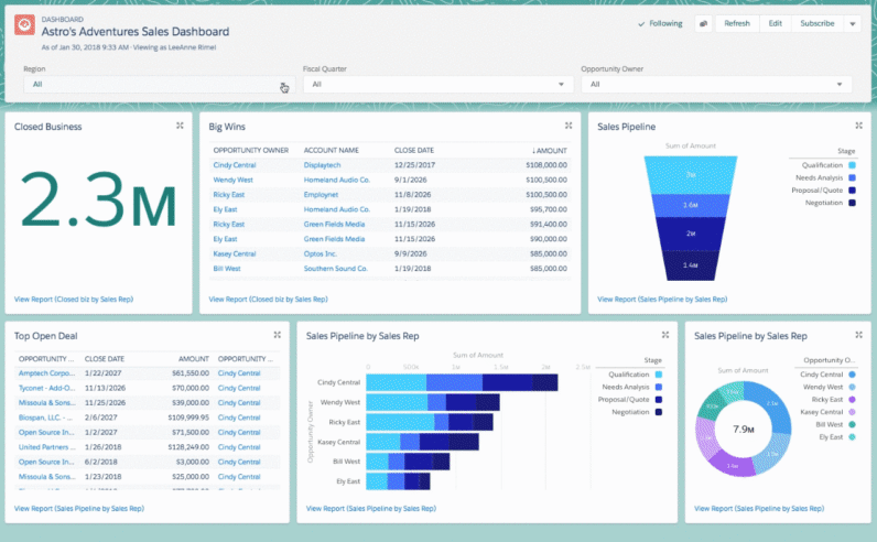
And wouldn't they look even more amazing on those huge tv screens every department has in the office but never uses!! 🤩
Oh...
Wait...
It doesn't work; like that... 😪
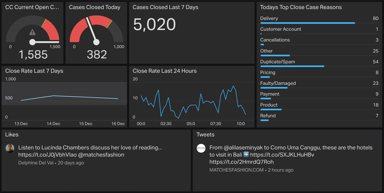
Well it doesn't end there because there are excellent products out there, my personal favourite being geckoboard.
Geckoboard uses your data in salesforce, your reports to display data on its own dashboard framework that renders really nicely to any tv screen. You can even render it on a screen in New York from your office in London.
I did however find a few issues with getting the scale range I wanted so below are a few tricks I deployed that you may find useful.
Service Cloud - showing just cases modified in the last hour?
Case > Formula > Checkbox with the formula...
IF( FLOOR( MOD((NOW() - LastModifiedDate) * 1440, 1440) / 60) <1

,true,false)
Because geckoboard is a bit limited we can now use this flag to just grab cases edited in the last hour. That's handy because all this tv stuff is meant to be super relevant to right NOW!
Now lets show when cases are getting closed in the last hour but lets break down the time frames into 15 min slices because otherwise our graph is going to get overwhelmed and won't render amazingly well.
Case > Formula > Text with the formula...
IF(LEN(
TEXT(IF(VALUE(MID(TEXT(ClosedDate - (0/24)), 12,2)) > 53, IF(VALUE(MID(TEXT(ClosedDate - (0/24)), 12,2)) < 23, VALUE(MID(TEXT(ClosedDate - (0/24)),12, 2)) + 1 , 1),VALUE(MID(TEXT(ClosedDate - (0/24)),12, 2)))))
< 2,
'0' + TEXT(IF(VALUE(MID(TEXT(ClosedDate - (0/24)), 12,2)) > 53, IF(VALUE(MID(TEXT(ClosedDate - (0/24)), 12,2)) < 23, VALUE(MID(TEXT(ClosedDate - (0/24)),12, 2)) + 1 , 1),VALUE(MID(TEXT(ClosedDate - (0/24)),12, 2)))),
TEXT(IF(VALUE(MID(TEXT(ClosedDate - (0/24)), 12,2)) > 53, IF(VALUE(MID(TEXT(ClosedDate - (0/24)), 12,2)) < 23, VALUE(MID(TEXT(ClosedDate - (0/24)),12, 2)) + 1 , 1),VALUE(MID(TEXT(ClosedDate - (0/24)),12, 2))))
)

+ ':' +

TEXT(
IF(VALUE(MID(TEXT(ClosedDate), 15,2)) < 8, 0,
IF(VALUE(MID(TEXT(ClosedDate), 15,2)) < 24, 15,
IF(VALUE(MID(TEXT(ClosedDate), 15,2)) < 38, 30,
IF(VALUE(MID(TEXT(ClosedDate), 15,2)) < 54, 45, 0))))
)
💥BOOM!
It means you can show, for the current 24hr period (as I did), records modified that are closed and then split this activity into rounded 15min segments. Or over the last rolling hour again in more clearly displayed 15min segments. The reason for rolling hour is that you are always looking back 60 minutes, not x number of minutes back for the hour you are currently in. It makes a difference! 😉
Managers can see how shifts of people coming back from lunch and other breaks affects the close rate of cases and if tracked through the weeks where the slow spots in the day are.
Some examples of what you can do (in a very short space of time!) - you can see I also connected this dashboard to a Twitter account - yes you can combine data sources from multiple systems, even raw csv files for systems without an available out of the box plugin; 🤯 ...yup!
*any tv screen rendering a graph needs to run a browser, an android stick would perform this function